We have a new logo in 2020
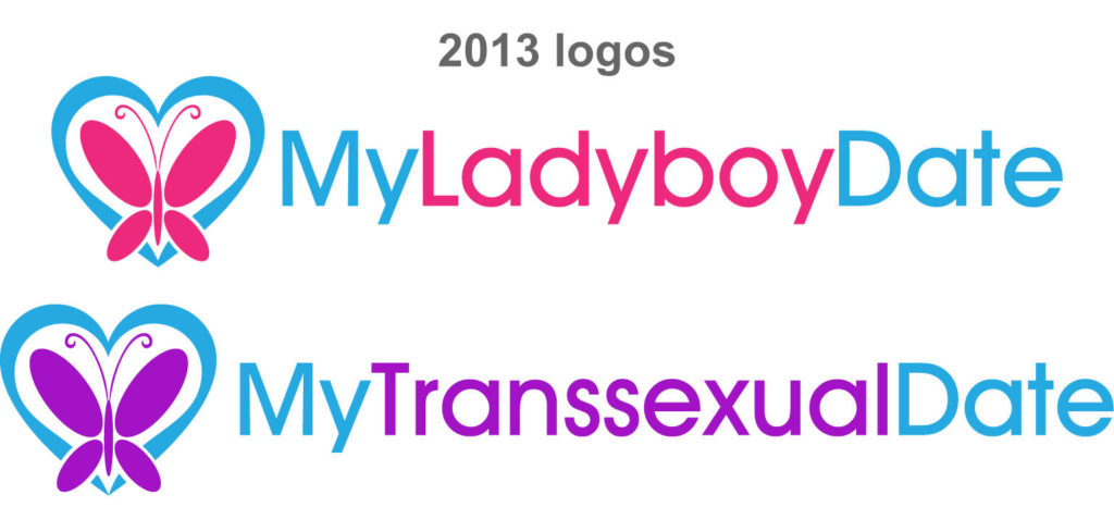
My Transsexual Date was launched in 2014, and its sister website My Ladyboy Date in 2013. Six years have passed, and we’ve gone far. Over the years the novel dating website for trans women gained an incredible lot of attention and became first in its category by a lot of metrics. However, the design and the logo haven’t changed much.

Indeed, our efforts were always focused on building a great product, to serve the trans community and help trans women and transattracted men find love. Providing you with a highly available website, fast and efficient chat system, 24/7 moderation, top notch security… was at the top of our priorities list. Next to that, polishing our branding didn’t seem to matter as much.
But now it’s 2020, our technologies and processes are well proven, so it’s the right time we give some love to our logo and the rest of our branding.
Let me introduce, our new logo:

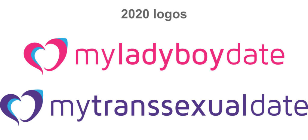
Our new logo was designed by French designer Aurélien Sesmat. He was naturally inspired by the previous logo and kept the heart (obvious symbol of love) as well as two of the three initial colours (same pink and blue, but a darker purple).
The heart is composed of two parts, to symbolise a couple. The typography for the site’s name is Ubuntu (regular and bold), and gives a more modern look.
What’s next
In line with our plan to refresh our branding, we are also in the process of refreshing the design of our whole website. In fact, you can see our blog is already refreshed, and the rest of the website is coming soon.
Also, our mobile app is currently under development and should be released soon too. We will tell you more about this soon!
How do you like our new logo? Let us know by commenting on this post or on our various social media pages.
Love ❤️
